
Top‑Decile Terrain: The 10‑Year Return Still Signals A Secular Bull Market In Progress

By James Picerno | The Milwaukee Company
The S&P 500’s 10-year return is comfortably in the top decile for historical results
AI remains a key catalyst for sustaining bullish momentum
History suggests that the secular bull run will eventually end, and investors should remain alert to hints of a peak
Although Wall Street has become increasingly focused on the short term, the stock market still moves in long-term cycles – so-called secular bull and bear markets. It’s easy to miss the forest for the trees in a world that’s hyper-focused on time scales measured in minutes and days. But it’s useful to periodically step back and consider the longer-term ebb and flow of the equities market and how current conditions compare with history.
A reasonable place to start is with the rolling 10-year annualized return. To further filter out some of the noise, the chart below uses monthly data to calculate S&P 500 Index performance. The current 10-year return is a strong 13.6% annualized increase (based on data through Jan. 14, 2026). That’s among the best gains for the 10-year window on record, ranking in the top decile for the past eight decades.
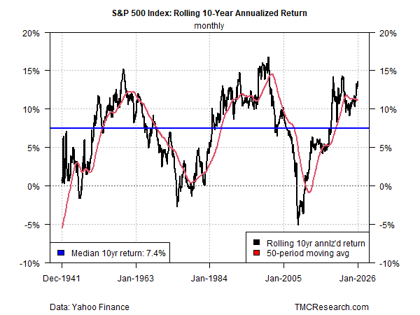
Although stocks have delivered even higher returns at times, it’s fair to say that the recent performance rarely exceeds the current run. Consider: peak performance for the 10-year result in the sample above was a stellar 16.8% annualized gain, briefly reached in 2000. Such heights are unusual. Indeed, the median for the decades shown in the chart is a relatively mild 7.5%. By contrast, the current 10-year return is nearly twice that pace.
The point in reviewing this history isn’t about looking for clues about timing the market. Rather, the value here is reminding that market cycles move in long, slow-moving trends, and that we’re still in what appears to be a secular bull market. Equity beta, in other words, is still doing much of the heaving lifting for portfolio strategies.
How long will it last? No one knows, but the chart suggests that at some point the cycle will peak and a period of relatively low and possibly negative returns will prevail. To be fair, counter moves within a secular market cycle, bull or bear, can provide opportunities for short-term traders and speculators. But even tactical-minded investors can benefit from tracking which way the secular winds are blowing.
Overall, the market’s secular bias can be a useful input for developing portfolio strategies, managing expectations, adjusting risk, and watching how or if structural market changes are affecting investor sentiment. Deciding if the tide has turned is challenging in real time on any given day, but when the cycle does shift it may become obvious in charts such as the one above. If such a turning point can be identified, adjusting asset allocation may be appropriate.
One metric that could be useful is watching a rolling window average for the 10-year return to capture a clearer measure of the trend. As an example, the red line in the chart above tracks a 50-period moving average. For the moment, this indicator suggests that the secular bull market endures. By contrast, a sustained downward move could be a sign of the opposite.
One chart can’t capture all the relevant context, and so investors should customize and broaden the analysis to match their particular strategy, time horizon, and other factors. A 10-year horizon is a reasonable baseline for a generic investor, but one round number isn’t necessarily optimal for every portfolio in search of strategic context.
Keep in mind that every cycle, bull or bear, has a unique set of catalysts. In the current climate, artificial intelligence is a key driver that’s keeping the bulls running. The question is whether the lofty expectations will be satisfied to a degree that supports the bull market? Key variables that will determine the answer include how the results stack up for corporate earnings, productivity gains (or the lack thereof), and economic growth.
Ultimately, every market regime reaches a limit. Where that limit lies in the current climate is unknowable for now. When the cycle does begin to roll over, it’s likely to become obvious in charts such as the one above.
