
Reading the Rubble: Gauging Recovery Odds When The Market Slides

By James Picerno | The Milwaukee Company
Looking for signs of market bottoms can be useful for managing expectations and estimating when expected return is relatively high
Three examples of metrics are reviewed for quantitatively estimating when the point of maximum market pessimism has passed
Market history suggests that various analytical techniques can provide a timely read on when a market has hit its low and a rebound has started or is near.
"Market tops are processes, bottoms are events," observes a popular Wall Street adage. The implication: the market peaking process tends to be a subtle affair, unfolding gradually and becoming obvious only well after the fact. Bottoms, by contrast, often arrive relatively quickly. For the biggest, most significant declines, the downturn is rarely subtle.
Nothing’s guaranteed with market behavior, of course, but market history suggests that the odds are somewhat more favorable for identifying market bottoms in a relatively timely manner vs. calling tops. Granted, we’re always going to be early or late for recognizing maximum points of market pain, but certain techniques can be helpful for developing calculated risk estimates and deciding if it’s timely for opportunistically tilting portfolios.
Consider the US stock market, based on the S&P 500 Index, which is no stranger to periodic selloffs, which can be sharp and relatively swift. Even when the slide unfolds over an extended period, the signs that point to a market bottom are sometimes conspicuous.
To be clear, calculated risk estimates in this corner are never flawless, even for the best modeling efforts. As a result, every forecast that the worst has passed is subject to the relentless uncertainty that weighs on all ex-ante efforts.
Nonetheless, crunching numbers to develop perspective on market corrections and crashes is a productive exercise. The reasons range from managing emotion during bouts of extreme market turbulence to deciding when the odds appear to favor a new recovery is in offing.
There are numerous methodologies for estimating the probability that a market bottom is in the rear-view mirror. Let’s review three basic setups. Each can be refined or combined with other metrics. But as a starting point, these are reasonable metrics to include your analytical toolkit.
We’ll focus on the S&P 500, although the modeling is applicable to other markets and securities. For simplicity, we’ll limit our focus to relatively extreme market events to illustrate the concept, thereby ignoring lesser downturns, which tend to exhibit more noise and less signal, and are there harder to analyze.
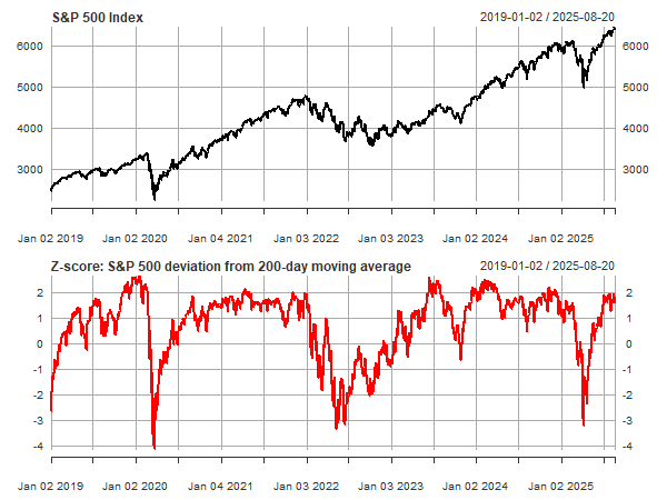
Z-scores and 200-day averages
The first example uses the S&P’s deviation from its 200-day moving average, with the results transformed to z-scores – a statistical measure that indicates how many standard deviations a given data point varies from the average. For context, keep in mind that 68% of values in a normal distribution are within 1 standard deviation (1σ), 95% within 2σ, and 99.7% within 3σ. The caveat is that stock prices (and returns) aren’t normally distributed, and so the use of z-scores has limitations. Nonetheless, looking at market behavior through a z-score lens is a useful first approximation.
In the chart below, recent history suggests that market declines that exceed 3σ have been relatively timely signals for assuming a downturn has run its course and so the start of a recovery may be near.
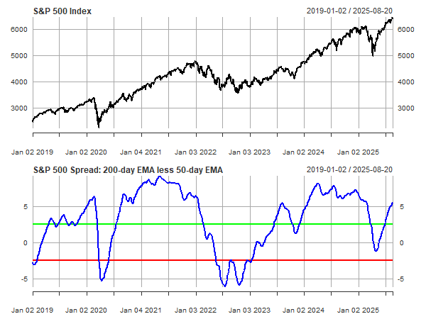
50-day/200-day Spread
A related metric smooths out some of the noise in the chart above with a pair of moving averages. The second chart below uses the percentage difference between the 50- and 200-day moving averages of the S&P 500 for guidance. Recent history suggests that when this spread falls below -2.5 percentage points (red line), the odds look favorable for expecting that the storm has passed.
For added confidence, one implication of the data is to look for the point (following a breach below the red line) when the spread rebounds above the red line. In those cases, conditions imply that a market recovery will persist or, if it hasn’t started, is near. A more conservative approach is to wait for the spread to rise above the green line (marking a +2.5 percentage point spread) to issue the all-clear notice after a slide below the red line.
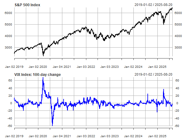
Monitoring The “Fear Index”
The VIX Index is also a useful tool for estimating points of maximum pessimism. As a real-time market estimate of expected stock market volatility, the VIX quantifies the consensus view for the risk outlook. A useful feature of the VIX (and stock market volatility generally) is that this definition of risk is mean reverting on a relatively short time scale. In addition, the VIX can and does spike sharply at times, often quickly, which is almost always accompanied by a market correction. This combination of features provides a basis for estimating when the storm has cleared.
As a filter to emphasize signal, it’s helpful to measure how the VIX has shifted in recent history. In this example, a rolling 100-day change provides context that can be obscured by looking at the index directly. A spike above 20 points for the VIX suggests that most or all of a volatility surge has passed. The intuition here is that after market volatility has spiked substantially, the odds are low that it will spike further, courtesy of the mean-reverting characteristic of the VIX. Note, however, that this methodology is less effective in the context of longer market declines. The 2022 correction for the S&P 500, for instance, was reflected in the VIX as a series of relatively moderate but ongoing volatility jumps. In other words, sharp vol spikes don’t accompany every market decline. Sometimes a long, slow grind lower prevails, in which case other analytics are needed, such as the first two approaches above.
As with all efforts to anticipate market events, the risk-monitoring strategies discussed come with the standard caveats. Bernard Baruch, a celebrated investor in the early 20th century, famously warned: “Don't try to buy at the bottom and sell at the top. It can't be done except by liars.”
Good advice, but we don’t have to perfectly identify the precise moment of a trough to make the analysis practical. Instead, developing quantitative context is the goal to take advantage of an empirical fact: markets offer different expected returns at different times. In turn, that implies that asset allocation should be dynamic in some degree.
There are many possible inputs for managing that dynamism. One is keeping an eye on periods when the market appears to have shifted to a downside extreme, which can be seen as a proxy for identifying a point in time that’s accompanied by a relatively high expected return.
At the moment, the US stock market continues to exhibit an upside bias, and so looking for points of maximum pessimism today is about as useful as an umbrella on a sunny day. But the financial weather inevitably turns stormy from time to time, which reminds us to always keep an analytical umbrella (or three) handy.
