
Market Peaks vs. Troughs: Timing Risk, Return Premiums, and the Healing Power of Time

By James Picerno | The Milwaukee Company
Market troughs offer a return premium, but timing precision is elusive and rarely repeatable
Performance drag linked to investing at/near peaks fades over time, especially beyond the 12-month horizon
Patience for new investments—especially near peaks—remains a key alpha lever
How much risk is bound up with investing at or near market tops? Conversely, is there a return premium associated with buying around market bottoms?
For some context, TMC Research ran the numbers and compared subsequent returns for the stock market (S&P 500 Index) for several time windows over the past half century-plus. The results suggest that while buying at or near market bottoms generates a return premium vs. investing at or near market tops, time tends to heal any performance wounds relatively quickly, or so the historical record suggests.
For a primer on how theses timing decisions stack up, we calculated 1-month, 6-month, 1-year and 3-year returns following market tops and bottoms for the S&P 500 starting in 1970 and ending in 2022 (the last year available for subsequent 3-year data through today). The results, shown in the charts below, align with expectations, namely: It’s generally preferable to buy around market corrections. But there are some caveats to consider. (Note: black dots in each bar indicate the median return for that time horizon.)
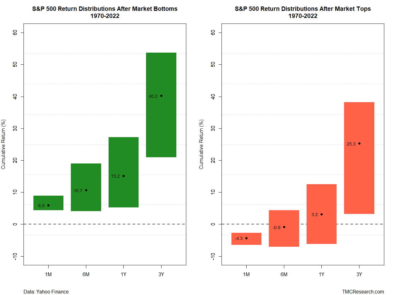
The performances are hardly surprising, although it’s important to think through the implications. Let’s start by recognizing that for a market that trends higher through time, as US equities tend to do, buying at or near tops is still a reasonable strategy for investors with sufficiently long time horizons. Assuming the S&P 500’s future will be reasonably similar to its past, the chart above suggests that a one-year horizons or longer will likely soften, if not repair, any short-term performance pain that arises from buying at/near tops.
One technical issue to keep in mind is that calculating returns following market peaks and troughs is sensitive to various assumptions, and so it’s crucial to note that we can torture the data so that it skews one way or another, depending on preferences. For example, the chart above reflects subsequent performances following a peak or bottom based on a rolling 60-day trailing window. Lengthen or shorten the window and the number of peaks and troughs decreases or increases, which in turn changes the subsequent performance results.
The use of a 60-day for the chart above isn’t intended to be the last word on this type of analysis, but it’s a reasonable starting point. Depending on the investor and her particular assumptions and expectations, reviewing different rolling periods can be useful.
Another key point: No one can identify tops and bottoms in real time. Even if you could accurately pinpoint market bottoms (unlikely), there’s still no guarantee that the market will rebound in a timely manner or in line with the historical results shown in the testing above.
What the chart above does suggest is that a degree of mean reversion generally applies to market results following peaks and troughs. That record translates into useful guidance. As Warren Buffett famously opined: “Be fearful when others are greedy, and be greedy when others are fearful.”
Good advice, up to a point. There are limits to everything, even sage counsel for investing. For example, if you’re using bull market peaks as an excuse to remain fully in cash, for example, you’re exchanging one type of risk for another and betting the farm on your ability to accurately time the market. Alas, the odds don’t look especially favorable on that front, at least for the average investor.
Perhaps the most practical insight in the chart above, and others like it, is that while investing at/near market peaks can be painful in the short term, returns generally tend to skew positive for investors with time horizons longer than a year. Meanwhile, be prepared to take advantage of market corrections.
None of this is a free lunch, given the uncertainty that accompanies any market forecast. Rather, one might think of the chart’s implied forecasts as a substantially discounted investment meal for those with the patience to look beyond the headlines du jour.
