
History’s Message on Yield Shocks: Stocks Bend, But They Don’t Always Break

By James Picerno | The Milwaukee Company
History leans toward resilience for equities after rate surges
Forward 1‑ and 2‑year returns skew positive across many yield‑spike scenarios
The first 3–6 months carry the most noise, making short‑run equity reactions highly path‑dependent
Inflation worries triggered by Middle East turmoil continue to hang over the global economy and financial markets. Economists are still debating whether hotter inflation driven by surging energy costs will persist or fade quickly once the conflict ends. The outcome may have implications for the US stock market.
The ongoing rise in Treasury yields is sharpening the focus on how equities might react to higher inflation. During Monday’s trading session, the 10‑year yield climbed to 4.44%, the highest level since the initial spike in late March. If the benchmark rate exceeds the war‑related peak of roughly 4.80% on Mar. 27, the move could signal a new phase for the bond market as investors demand a higher risk premium for fixed‑income securities.
To help manage expectations by studying history, TMC Research analyzed how US stocks (S&P 500 Index) have performed following run‑ups in interest rates, using the 10‑year yield as a proxy. The review covers market behavior since 1970, a period that includes several inflationary episodes. The common assumption is that equities routinely suffer when inflation heats up and interest rates rise. But a quantitative look at the historical record tells a more nuanced story, as shown in the chart summarizing the distribution of stock‑market performance over various time horizons following yield spikes.
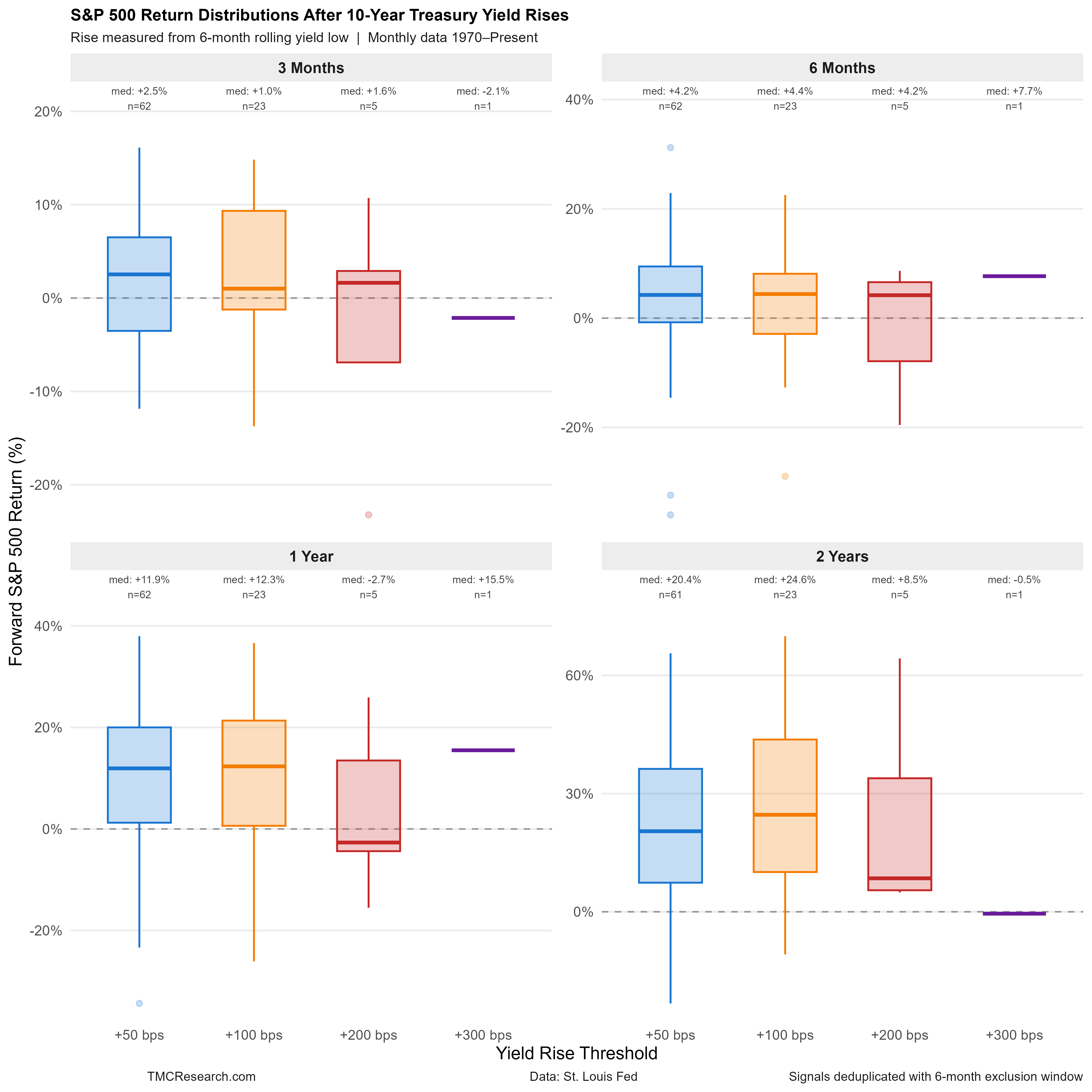
There are many ways to test how the S&P 500 reacts to sharp increases in the 10‑year yield, but the chart above reflects one specific framework. The analysis uses monthly data to reduce short‑term noise and focuses on relatively large yield increases—defined as instances when the 10‑year yield jumps sharply relative to its lowest level over the prior six months. The S&P’s subsequent performance is grouped into four horizons: 3 months, 6 months, 1 year, and 2 years.
Within each horizon, the distribution of S&P outcomes is further divided into four buckets based on the size of the yield increase: 50, 100, 200, and 300 basis points.
For example, the blue bar in the upper‑left panel shows the range of S&P returns for the 3‑month window following a 50‑basis‑points or larger yield increase. The horizontal blue line marks the median return (2.5% in this case). The box represents the interquartile range (25th to 75th percentile), highlighting the most frequent outcomes. The vertical whiskers show the outliers—the most extreme performances.
For more context, each bar includes a sample‑size label (“n”). In the 3‑month, +50‑bps example, the sample size is 62. As the size of the yield increase rises, the sample size falls, reducing statistical reliability.
The “n” counts also reflect a 6‑month exclusion window to prevent a single, ongoing yield surge from generating multiple signals in quick succession.
In short, the analysis relies on a specific set of rules. Changing the rules will change the results, but the profiles above offer a useful first approximation for estimating how the stock market might respond if Treasury yields continue to rise.
The main takeaway: equities tend to be relatively resilient after yields rise. There’s no guarantee the future will repeat, but history suggests that yield spikes off cyclical lows have more often marked periods of equity strength rather than stress, especially over 6‑ to 24‑month horizons.
The caveat is that every event is unique, driven by different circumstances. That’s worth considering in the current climate, when the Iran conflict is injecting a geopolitical risk premium into energy markets and threatening to amplify inflation pressures in ways that may not align neatly with historical patterns.
