
5 Trend Indicators For Deciding If The Bull Market Is Breaking Down

By James Picerno | The Milwaukee Company
Several trend indicators suggest last week’s market decline is noise rather than a market reversal
Monitoring several facets of stock market activity are useful proxies for assessing the near-term risk outlook
Defensive sectors and value stocks are not yet outperforming, suggesting the bull trend still has room to run
The jury’s still out on whether the sharp decline in stocks on Friday, Oct. 10 is a new warning for the market or another bump in the road for an ongoing bull run. Either way, filtering market action through a set of trend indicators provides a relatively objective lens to counter the urge to let the news headlines du jour drive decisions on asset allocation and investment expectations.
There are many ways to model market trend. Here are five profiles (using ETFs) that are a practical starting point for developing calculated risk estimates on the near-term bias for the equity market. All the usual caveats apply, but the underlying logic of the analysis below runs as follows: Until there’s compelling evidence that the primary trend is reversing, there’s a case for assuming that the current market bias will continue.
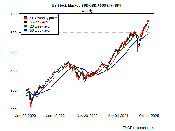
S&P 500 Index Weekly Trend
Let’s start by reviewing a popular measure of stocks writ large via the SPDR S&P 500 ETF (SPY). To suppress some of the noise, weekly data is used (here and throughout). Despite the alarming headlines following Friday’s selloff, the weekly setback is still mild. SPY fell below its 5-week moving average, but that’s a routine event that rarely signals a secular decline. A more concerning warning would arise if the 5-week trend (black line in chart below) slides below the 20-week average (green line), which would signal a significant downshift in market sentiment. For the moment, such a shift doesn’t look imminent.
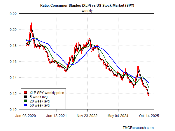
Consumer Staples Stocks vs The Broad Market
As a check on the sentiment analysis for the S&P 500, it’s valuable to compare the signaling for consumer staples stocks (XLP) relative to the broad market (SPY). In times of elevated market stress, staples tend to outperform stocks overall as investors seek relatively safe havens. In those periods that favor lower risk exposure, this ratio (red line in chart below) is rising. But as the latest data shows, staples continue to underperform the broad market (SPY), which aligns with the S&P 500’s weekly trend noted above.
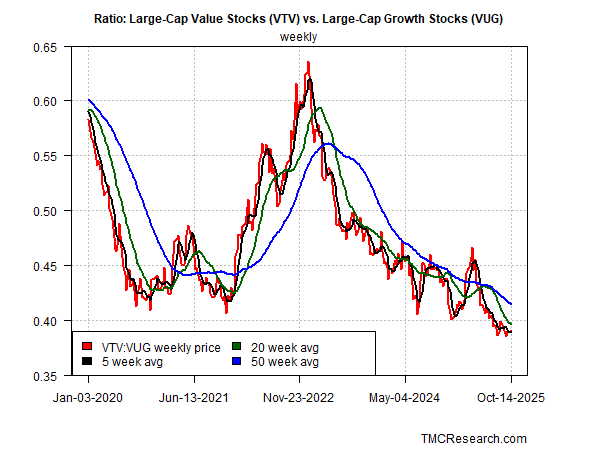
Value vs Growth Stocks
Another check on the S&P 500 trend is comparing how value stocks (VTV) are performing relative to growth shares (VUG). Echoing the historical record with staples stocks, value shares tend to outperform growth during periods of heightened market volatility and stress, a scenario with a rising trend in the VTV-VUG chart below. That was true during the 2022 market correction, but recent history shows that value (VTV) continues to underperform growth (VUG), offering another clue for thinking that the broad market’s primary trend has yet to buckle.
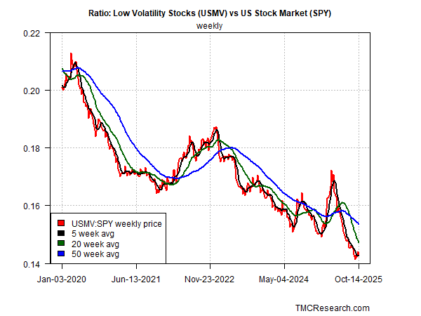
Low-Volatility Stocks vs the S&P 500
Another lens for evaluating the market’s primary trend is comparing shares that exhibit low volatility (USMV) against the S&P (SPY). Low-vol shares are also considered a defensive subset of the market, which is why they tend to outperform during periods of rising market stress and investor anxiety. In those periods, the USMV-SPY ratio rises. But here, too, the opposite is still unfolding as this ratio trends lower, suggesting this measure of market sentiment has yet to signal a meaningful break in bullish sentiment.
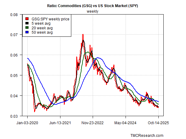
Commodities (GSG) vs. the S&P 500 (SPY)
Finally, let’s review how commodities (GSG) are faring relative to stocks (SPY). Given the recent concerns that tariffs may raise inflation, this ratio is a timely proxy for assessing market concerns on this front. In 2022, when inflation spiked, commodities (GSG) outperformed stocks (SPY) by a wide margin, per the dramatic rise in this ratio in the chart below. In recent months, by contrast, the ratio continues to trend down, which suggests inflation concerns are relatively subdued and therefore don’t yet pose an immediate threat the stock market.
The analytics above could change, of course, and surely will at some point. But the current view suggests that the market’s upside bias remains intact. It would take quite a bit of additional deterioration in stock prices to persuasively argue that the upside trend has peaked. There’s no way of knowing when such a peak will arrive, but the charts suggest the odds are low that the market summit has started or is imminent. When the risk appetite shifts, we’ll likely see the emerging evidence in the indicators above.
